

Boxing Class Leaderboard
For exercises that generate real-time performance data (e.g. distance, calories burned, repetitions), many fitness classes encourage friendly competition through a digital leaderboard visible to their students for the duration of a session. Design a two-screen experience including a large television display for the leaderboard and a simple smartphone app for agreeing to participate and choosing a public identity.
Role
Concept
Research
Design
Platform
Android
Date
2017
Research & Competitive Analysis
I started off by researching fitness classes and what makes them exciting to people in general. I did multiple rounds of competitive analysis on how fitness classes run, took notes on what was great and also what could be improved upon. I watched several videos on different types of workout classes. I interviewed several friends who had attended these classes to get real user data in order to validate my designs.
Understanding the Problem
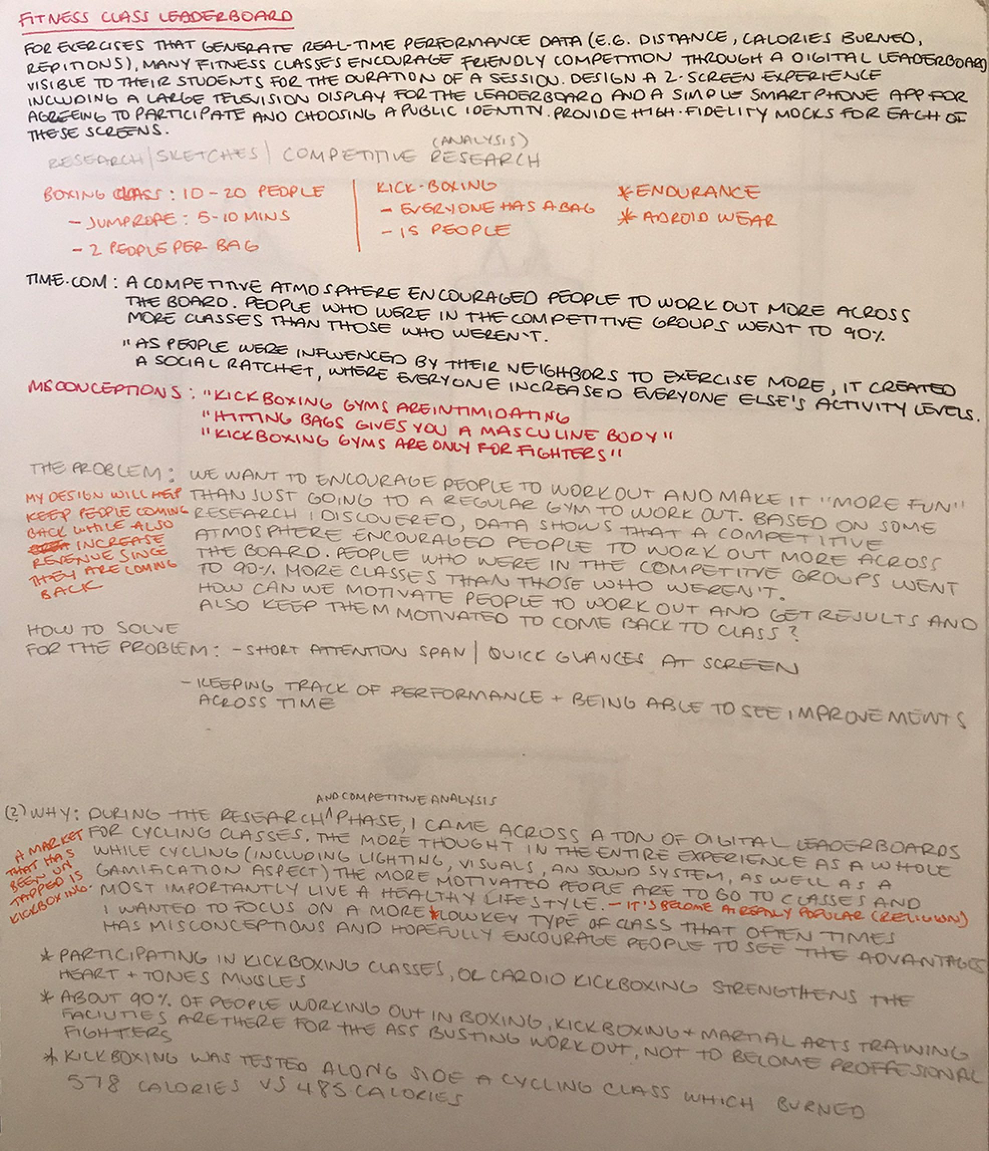
We want to encourage people to workout and make it "more fun" than just going to a regular gym to work out. Based on some research I discovered that a 'competitive atmosphere encouraged people to work out more across the board. People who were in the competitive groups went to 90% more classes than those who weren't.' 'As people were influenced by their neighbors to exercise more, it created a social cycle, where everyone increased every one else's activity levels.' How can we motivate people to work out and get results but also keep the motivation going in order to keep coming back to class?
During the research/competitive analysis phase I came across a ton of digital leaderboards for cycling classes. I found that the more thought from an end-to-end experience as a whole while cycling (including lighting, visuals, sound system as well as gamification) the more motivated people are to go to classes. But most importantly this led to living a healthy lifestyle. Real time data shown in classes based on performance was key to keeping them motivated. The experience gets people pumped up and actually working harder because you want to see the results up on the screen immediately.
A market that has been untapped is kickboxing. I wanted to focus on a fitness activity that often has misconceptions and hopefully encourages people to see the advantages. Some common misconceptions include: intimidating, developing a masculine body, and kickboxing being seen as a sport only for fighters. Kickboxing actually strengthens the heart and tones muscles. It was tested along side with a cycling class which results shown 578 calories burned in kickboxing class vs 485 calories in a cycling class, in a shorter period of time. On top of all this, it would also be a great opportunity to increase revenue for kickboxing class industry.
UI Requirements
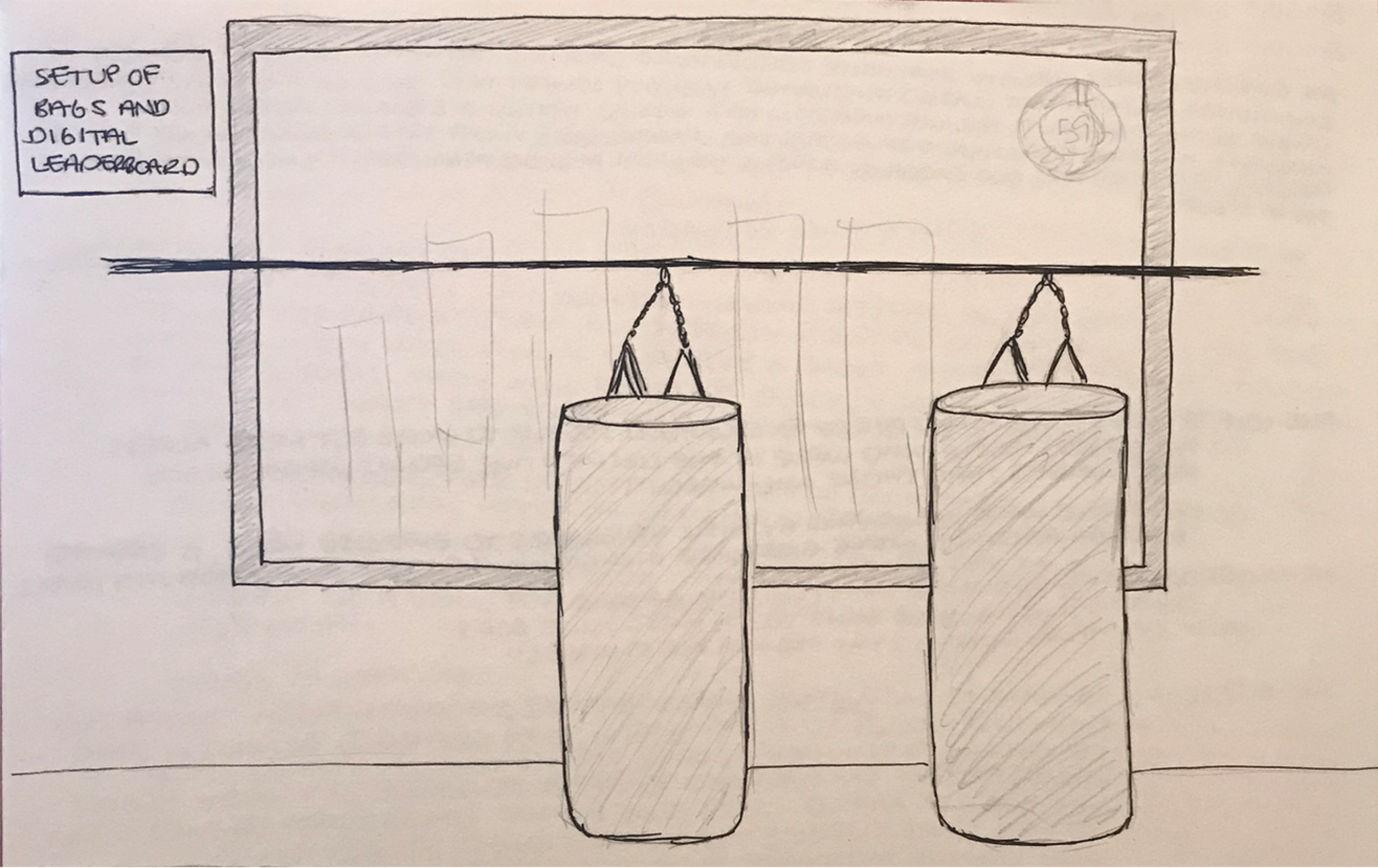
Based on the technology used for smart cycling bikes and boxing bags used for arcade games, we can assume it is possible to have smart boxing bags for kickboxing classes. They can track how hard a person hits the bag and how many punches/kicks, etc. In order to track cardio/calories burned, etc. Android wear can be used in order to track this piece of the workout which can potentially be provided by the class instructors.
Assuming kickboxers will most likely be staying in the same location during their workouts, and also keeping in mind that they will be pretty focused on hitting the bag for example, they will probably have a very short attention span to look at the screen. They will need to quickly glance at the screen and look away in order to maintain focus on hitting the bag.

Wireframes
After sketching out requirements and needs from the user's perspective, I then went ahead and switched to Sketch to start some wireframes and putting my thoughts in a more refined structure.
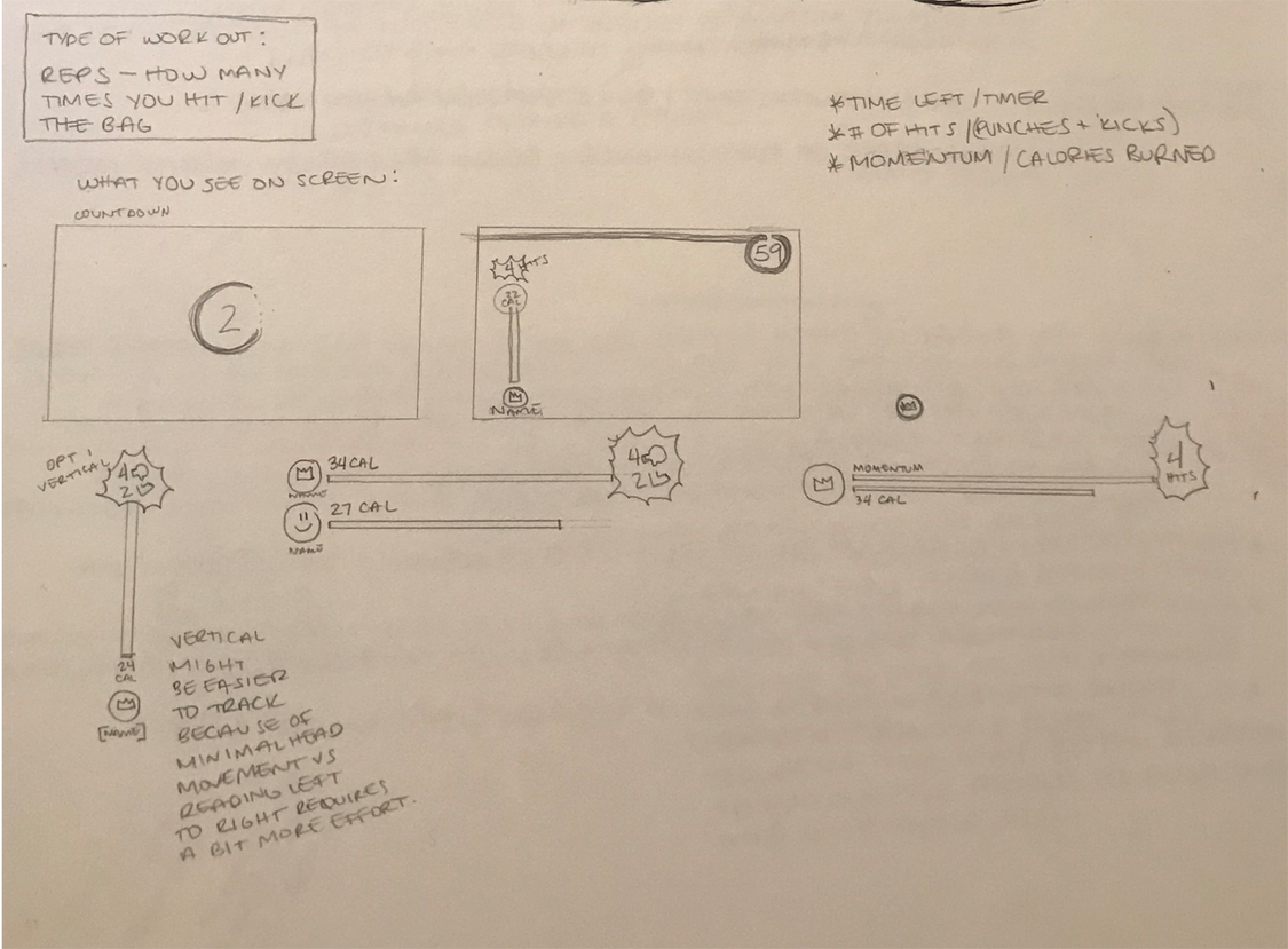
I decided to focus on a rep exercise for how many times a boxer would hit the bag along with showing how many calories each user was burning. After a couple of iterations, this is a structure I came up with for the Leaderboard:
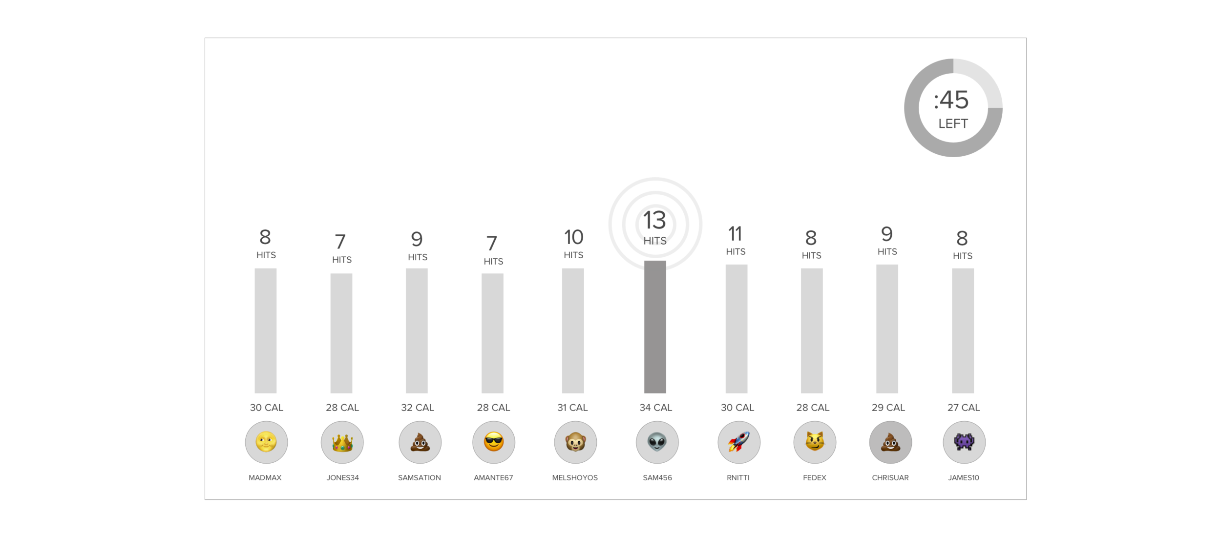
I went with the vertical layout of the stats since I figured it would be easier to track because of minimal head movement going from the bottom to the top of the screen. The horizontal layout felt a little bit more uneasy since the user would have to read left to right which seems to require more effort especially while boxing behind a bag. My main focus, again keeping in mind that users will most likely have a very short glance attention span, was to focus on the following:
The user name (username instead of full name is a better approach since people might feel a bit uncomfortable having their name up on screen for everyone to see)
User generic avatar (this makes it personable so user can easily find where they are on screen, also taking into account privacy)
Who is currently winning/where you are (there needs to be more visual emphasis on who is ahead so it is super clear with a quick glance)
Timer–sense of urgency (users need to know how much time they have left in order to create that push and final motivation to get the most out of their workouts)
As far as the smartphone app screens go, here is the structure I laid out in wireframe form:

Visual Design
When a user gets to the class for the first time (assuming such technology like BluetoothLE/iBeacon is used to detect), they will be asked to download the app to pair their device in order to set up their profile and accept terms.
[Screen 1] Launch Screen/Loading Screen]
[Screen 2-3] Scan the code to pair your “Smart Bag”. Since there will be a bunch of “Smart Bags” in close proximity to each other, it is probably more accurate for the user to simply scan the smart bag with their device in order to avoid picking up the wrong bag etc.
[Screen 3-5] (Bag is paired) Choose username and emoji for public identity. Choosing a generic emoji, in this case, system emoji will be a faster flow so that users don’t waste time choosing a picture or even taking one and also don’t need to worry about their face being on screen if they are self-conscious about it.

The background of the app is carrying over colors used for stats for the onboarding piece. The “Scan Now” button uses the ripple ‘Hit’ effect to draw attention to the button since it is such a crucial piece of the whole mobile app. The visual of the barcode location on the icon should help the user locate the barcode in real life so they can quickly get set up and ready for their workout.

Fin